

GoTo Rescue landing page improvements.
Optimizing the landing page experience to increase conversions.
Role
Design Lead
Timeline
Jul 2023 - Sept 2023
Skills
Design Thinking
User Research
Interaction Design
Visual Design
OVERVIEW
What is the challenge?
PROBLEM
Rescue launched a pay-per-click (PPC) campaign using their website resulting in low conversions. Their conversion rate of 0%, was below the category average of 5-6%, for their PPC campaign in the Remote Support software category.
GOAL
Provide a seamless and linear user journey, keep the primary focus on the GoTo Rescue product, and match visitor expectations while improving the overall conversion rate.
SOLUTION
Design a high-converting landing page with Rescue's team focused on the Remote Support software category targeted by their campaign. The page would act as a one-stop resource to learn about the product and guide prospects down a streamlined conversion path.
SCOPE & CONSTRAINTS
As designer, I performed all necessary tasks including research, market analysis, content strategy, A/B testing, copywriting, interactive design, and visual design. Due to this and timeline constraints, it was imperative to have a concrete design process to ensure launch.

APPROACH & STRATEGY
Optimize the landing page to guide users through the conversion pathway and increase conversion rate.
I was tasked with improving lead capture and conversion rate for the client. My strategy and approach was to implement a high-converting landing page to provide lead prospects with a one-stop shop to learn all they need to know about Rescue.
The prospective lead (user) struggles to find critical product information needed to determine if Rescue is the solution for them. Utilizing a landing page solves the "is this the solution to meet my needs?" and allows me, as the designer, to employ all UI/UX research and best practices to deliver the best experience.
RESEARCH
Prospects are unable to find critical information, which is often scattered, outdated, or missing.
My research process marries both quantitative and qualitative data to inform my strategy and design. I utilized derived data by reviewing internal Gartner databases to identify what the average conversion rate is amongst competitors in the Remote Support software category. With this data, I tested whether analytics tracking was overfiring for conversions, reporting false data, or not properly equipped. I was able to determine that the average conversion rate was between 5 - 6% amongst competitors in this category.
Industry research confirmed what layouts, benefits, features, copy, and designs were performing successfully in competitor campaigns. By cross-referencing user reviews and feedback, I was able to calculate what key differentiators prospects were looking for, whether that was in benefits, features, etc.
With this in mind, I used the above research to highlight the aspects of Rescue's software that would best appeal to the end user.
IDEATION & DESIGN
The design process of this one-woman show.
Rough, quick UI sketches allowed me to iterate, experiment with layouts, and identify opportunities for improvement and helped me to kickstart the idea generation and design process. The result was scalable wireframes based off my research findings and the commonalities between competitors in the Remote Support category.
Based on feedback from fellow designers, I iterated on the design a few times before moving to a high-fidelity mockup. There were concerns around the client's somewhat strict brand guidelines and marrying them with WCAG guidelines. The CTA color, image screenshots, and form design received the needed updates that the client approved for the final design.
REFLECTION & TAKEAWAYS
Not every feature will make it to the launch.
Designing, coding, and launching a landing page in 2 months is no small feat, especially when wearing many hats over the scope of the project. Due to timeline and capacity constraints, not every feature could be added prior to launch.
The landing page was still an overall success despite a quick timeline and some design feature/interaction tradeoffs. I attribute the positive results of this project to not only caffeine but to a thorough design process. Setting project stages helped with focus and managing a strict timeline. It taught me to be flexible in the face of iterations or design pivots.
After the page launched, we saw an extra 7.41% increase in conversion rate after 30 days.
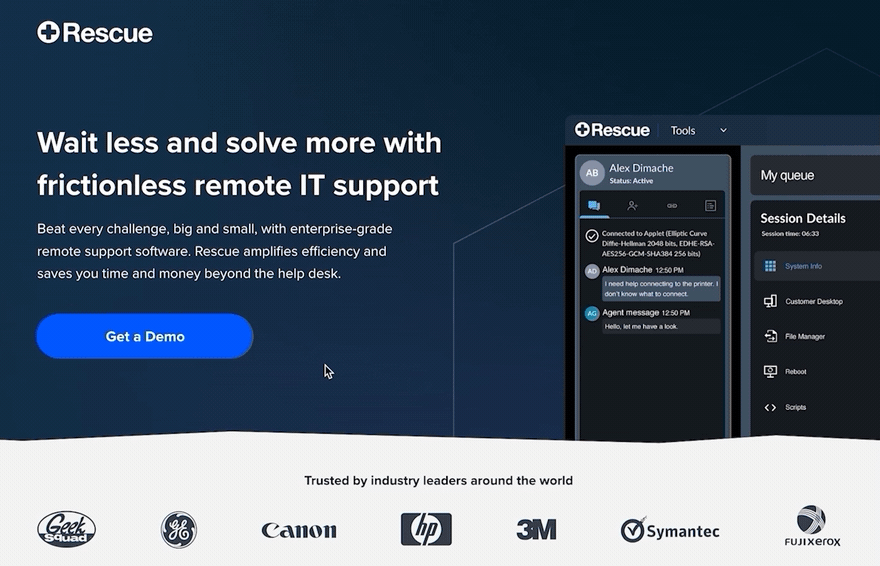
FINAL PRODUCT
Take a look.

